Dr. Rochford Logo + Stationary
![]()
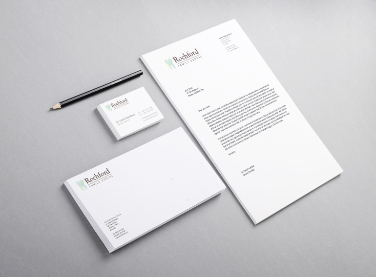
In this project, the goal was to design a very soft, welcoming dental logo for Dr. Rochford’s practice. This practice wanted to emphasize the care they demonstrate with each and every patient. Transparency and shape are used playfully to create the heart shape within the tooth. To counteract the fear and anxiety that some patients feel towards their dental visit, calming blues and greens are used to avoid the reminder of blood that comes with warmer colours. Finally, the typography is set using a friendly, yet professional round serif and san serif combination set in a soft grey.
All rights reserved. © 2025 Kaycee Ng