Content Management Android App
This app was created so users can access their desktop Content Management System, on the go. This mobile app was created to give desktop users the ability to perform most of the same functions found the parent software, in a mobile environment. This required careful examination and reinterpretation of the UX of each feature of the original software.
This app was created with strong use isomorphism. With so much interaction required for multiple functions, the goal was to create an engaging digital environment that tempted and challenged the user to press, slide, tap and explore.
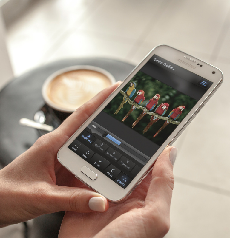
This app allows the user to manage their content as well as images on their website. Above shows the image editing screen, with just some of the available editing features you can control.
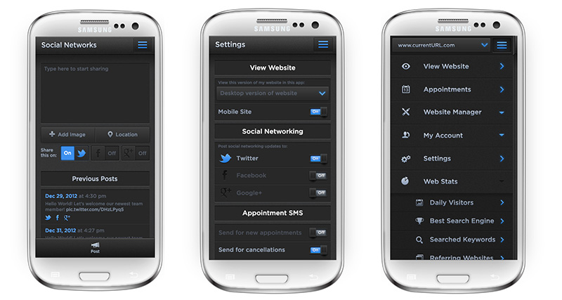
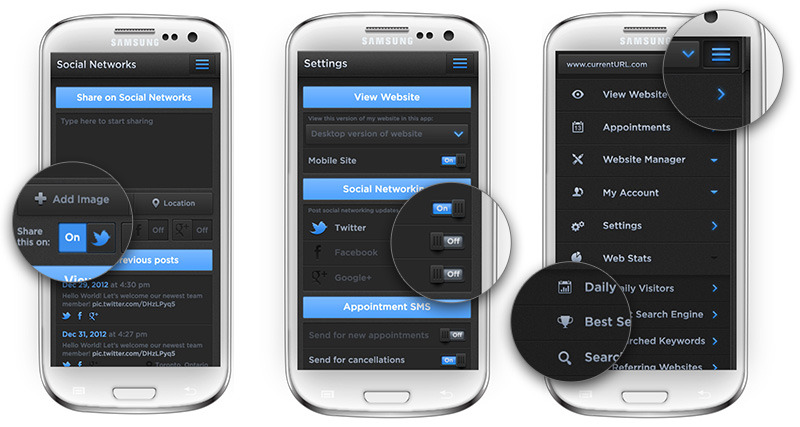
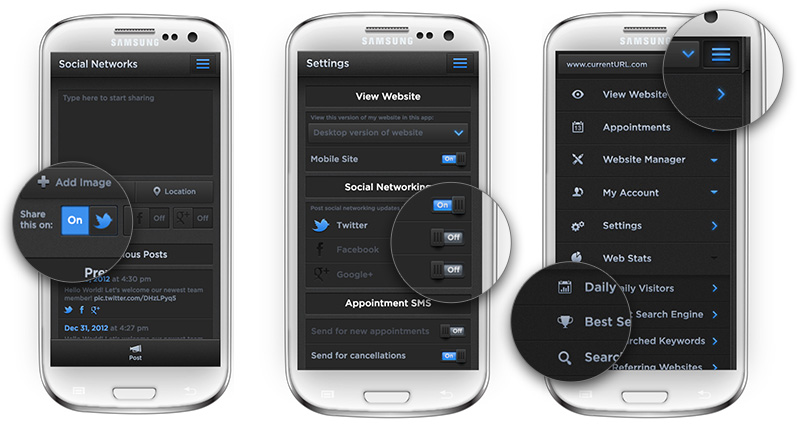
Three more sample screens are shown above. The blogging screen enables you to update your social media on the go. The (usually mundane) settings page is spiced up with great attention to creating very “press-able”, very isomorphic buttons. The overflow page slides in from the left and appears to exist on a slightly lower plane. This gives the app another level of depth and more tactile feel. Detail shots can be seen below.
All rights reserved. © 2025 Kaycee Ng